|
Dieses Tutorial wurde ursprünglich von Bracer Jack erstellt und auf seiner Webseite www.bracercom.com veröffentlicht.
Ich war enttäuscht, als es nicht mehr verfügbar war.
Kürzlich habe ich es jedoch in einem Archiv gefunden.
Obwohl ein paar kleinere Teile fehlen, habe ich entschieden, es auf meiner Webseite wieder zur Verfügung zu stellen.
Auch das LCARS Manifest, das weiter unten erwähnt wird, habe ich bereitgestellt. This Tutorial has been created originally by Bracer Jack, who had it on his website www.bracercom.com. I really liked this tutorial and was sad when it went offline. However, I found it in an archive lately. Although some minor parts are missing, I decided to make it available again on my website. I also republished the LCARS Manifesto that is mentioned below. |
|
Purpose of Tutorial
In this tutorial, I will share with you some guidelines that will help you create a more "Coherent" looking LCARS interface.
By coherent, I mean how stable/together/part of each other/consistent your LCARS interface looks.
Most of what you are about to read applies not only to the LCARS interface but also to interface design in general.
Disclaimer
LCARS was designed by Michael Okuda as the computer interface aboard federation vessels in the Star Trek Universe.
In honor of him, LCARS was often referred to as okudagrams.
I claim no authority over the standardization of LCARS nor do I desire it to be restricted.
This tutorial was written as an entry level guide for the LCARS enthusiast. Nature of LCARS
LCARS inherently has a very clean "vector" look to it without all the gradient and emboss effects.

One would suggest using the pen tool exclusively for the creation of the elementary LCARS frames though this might not apply to its main data displays.

The nature of LCARS is such that it can bend here or there to frame whatever content it is displaying.
The LCARS Frame
Here are the common frame structures, notice I did not segment it but kept it continuous for the number of segments in a frame is up to the number of options you want your application to display upfront. 
The LCARS "Frame" always goes from thick to thin and vice-versa; it is NEVER the same in thickness by the next turn.

The LCARS Swept is a very important element of the LCARS interface; do not disfigure it.

The LCARS Cap
If LCARS where to be described as a form of grammar, its rounded cap would most certainly be its period [fullstop for the Brits]. The rounded cap marks the termination point of an LCARS bar. Its “unconnected” nature also very naturally lead itself to be used as a button; it all makes complete coherent sense. The following are some examples of the LCARS Cap in use. 
The following however, is pure nonsense; LCARS created with these caps most certainly marks the amateurish level of its creator.

Spacing
It is a well known fact throughout the field of Design that if you want to introduce order to chaos,
align the elements up with some sort of invisible grid.

There are two main spacing constants in a typical LCARS interface, the Main Frame Spacing and the Spacing of the Frame itself.
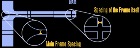
The only two elements that don't inhere to the spacing standards are the four main buttons on top of the frame and the spacing of the text as they have their own type face spacing.
Try to make sure your other elements inherent to one of the two established spacing for a consistent look,
else you will inherent the disjoined look that is a staple of the amateur LCARS designer.
Font Usage
Font Type:
I always use the LCARS Font for LCARS interfaces but it doesn't matter, whatever font you use, just make sure you stick with it. Consistency is very important in interface design. Fortunately I have not seen an LCARS interface littered with font varieties the way it had been with colors.
Font Size:
There should only be three different font sizes for your LCARS interface. 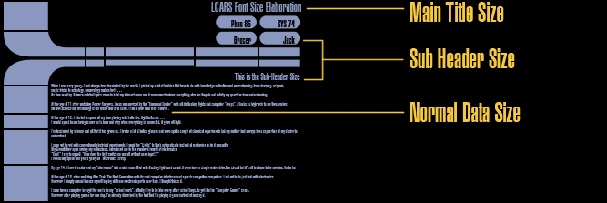
1: The Main Title Size – For the main title of your application or what it's currently doing. 2: The Sub Header Size – For the top four main buttons and any Sub Header in the main content area. 3: The Normal Data Size – For the scrolling numbers on the top frame and content details.
If you want to break the overall consistency of your interface by playing with different font sizes all the time,
you had better know what you're doing.
Unless there is a valid reason to do so, your text should only possess two colors, one for normal display and one for highlight
to signify whichever data currently highlighted are being processed.
LCARS Color Usage
One of the most easily committed crime when designing the LCARS interface is the use of color with a vengeance.
You can spot it a mile away, Multi-Color LCARS...
Let me be blunt here, either get your color theory straight or don’t use it at all.
I would rather see a monotone LCARS interface than one that looks like it had just came out from some sort of horrific color vortex.
It's a cheap trick used by cannot-make-it photographers, usually bimbos and people that really have nothing much in them,
take a totally ordinary photograph and remove all its colors, the bimbos would then find it easier to lie to themselves about how deep or amazing their photography skills are, how they have a different perspective in life and all that crap that only people not in the field would believe them.
I don't care if there is a rule out there that says that there are more than XXX colors in the overall LCARS color scheme.
There is nothing worst in the world of interface designs than to have an interface filled with colors totally unrelated to each other.
I'm not telling you to be afraid of colors, I'm telling you to understand the usage of it.
Read up on color theory; understand the different color schemes from Complimentary to Tetradic and why it is appropriate to use a certain scheme and not others in certain situations.
Once you understand colors, you will never tolerate amateurish LCARS color schemes again.
With true color understanding, you will never again be trap by the so called "LCARS Color Scheme".
You will be able to pick your own color scheme that is of your favorite hue and know that the color combinations you pick will work. This is real freedom derived from true understanding.
The cannot-make-it-but-want-to-act-important people will say things like "But one must think out of the box...must break away from color theory bla bla bla".
A master would "break" the color theory because he knew what effect the "new" color would have against its harmonious counterpart and
it would be carefully controlled and deployed to reach the desire effect and no more.
Here are the rules of thumb for LCARS color usages:
One Color: You can never go wrong with using just one color though it might look boring and also convey the idea that you are too fearful of the usage of colors. Try to use different Tints and Shades [5 of it at most, that's the limit] of that single color to get variety.
Two Colors: Same as with the usage of one color, just make sure all the hue and color combinations do not exceed 5.
Three Colors: Good, you can stop right here, maybe two more tint and shade values if you absolutely have to.
Four Colors: OK you're reaching the danger zone; make sure you assign meaning to the four different colors,
example: a color for idle, a color for normal operations, a color for real-time operations & a color for text. No more.
Five Colors: You had better know what you are doing with all those colors and there had better be a good reason why you have another color.
What is the symbolic meaning of the fifth color ? When a button is flashing in that color what does it mean ?
Six Colors: I have not seen any LCARS interface with more than five colors and looked right.
I don't care if it's a shade of a shade of a tint of a shade of etc; use it at your own peril. I'm not saying you can't; just don't make a fool of yourself if you do.
Color is a very big part of LCARS, go ahead and multi-color your LCARS...after...you've learned your color theory.
LCARS Animations
For those of you who use LCARS merely as decorative ornaments, I would like to enforce two points that most animators overlook.
The very first LCARS Animation available for download is from LCARSCOM.net as video form.
The usage of video comes along with it several limitations, from the inability to display black as true black to easily detectable animation loops, meaning you know when the animation had restarted.
Modern LCARS sites allow for the downloading of the *.swf file itself and for those that wish to protect their work, in Flash projector form.
However, many new LCARS animations still suffer from one problem associated with its video counterpart - obvious repetition.
There are a number of ways to solve this, from just a slight improvement to total eradication of the problem depending
on the programming capability of the designer.
Tip 1:
Put the scrolling number animations in their own timeline [movieclip], better yet, split the scrolling number animations up and give them different animation time lengths. Put the content animation in a time line of their own. What one is trying to achieve here is to prevent all the animations from ending at the same time so that it will not loop so obviously as a single entity, the more independent timelines, the better, split split split !
Tip 2:
Use code to generate random numbers instead of key framing it, in all honestly, I personally find key framing random numbers to be illogical.
Tip 3:
Use code to do animations, from scrolling numbers and highlights to the motion of all the content displayed if one is capable of doing so. This tip alone will eradicate all repetitive problems but minimal intellect is required. Another reason to use code is because in the long run, it's just so much less work, key framing everything is pretty low brow. Smack down:
After you have had enough experience with LCARS, here is your "right in the face" smack down:
To hell with all the rules, yes you heard that right, from the very person that creates this tutorial.
You can do this not because you desperately hope that people may at least pay some notice to your existence for your rebellion
else you have nothing to show for but because you know WHY the rules are there and hence you are no longer a drone follower
spending the rest of your time telling people what not to do like you are some sort of nothing better to do incompetent.
Now that you know why the rules are there, you can "add" to its perfection or purpose and improve upon the existing concept.
The finest example is the System 47 LCARS Screen Saver by "MeWho.com" with its gradient LCARS, the look delivers, which is the prime purpose of the screen saver. 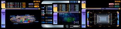
LCARS cannot be multi-color ? To hell with it, if you can make a rainbow color LCARS that doesn’t make a professional
turn his head and moan at your ignorance in color theory then you’re the Boss !
LCARS cannot be 3D ? To hell with it, if you can make it work, you’re the Boss.

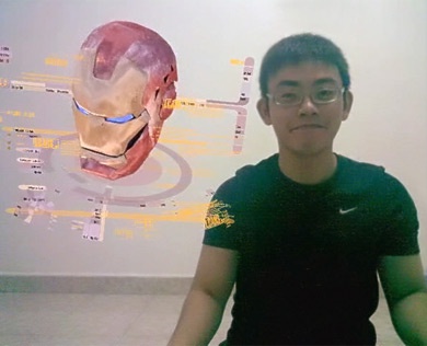
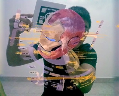
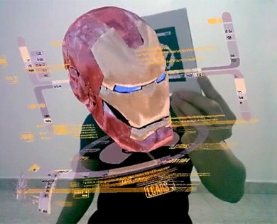
As a matter of fact, I had been investigating on pushing LCARS into the holographic realm using real time augmented reality technologies with what I feel to be promising results.
All your rule breaking power will never work in your favor without you understanding why the rules are there in the first place.
Remember this: Stupid people follow; the wise improve upon existing principles. Conclusion
That sums up the basics of LCARS implementation from real world applications to decorative ornaments.
The following addresses are no longer working since the tutorial has been taken offline by Bracer Jack:
If you have any further enquires, feel free to contact me at
bracercom@hotmail.com
.
Update:
I wrote an even more involved LCARS Manifesto when I was high...you can read it here but be warned, it is SUPER Detailed into CRAZINESS ! Please feel free to skip this link. |